Logistics/Telematics
Setting the Stage: What is BlackBuck?
Before diving into the project details, let's set the context. BlackBuck is a logistics company that's revolutionizing the trucking industry in India. Their mission? To digitize trucking and create seamless connections between truck owners and businesses for efficient freight management. Think of them as the digital backbone of India's trucking ecosystem.
The Project: Fuel Sensor System
At its core, the fuel sensor project was about giving users more control and visibility over their fuel consumption. It's a feature that allows fleet owners to monitor their vehicles' fuel levels through an external device, providing real-time information about fuel status. While it might sound straightforward, the implications for users are significant—it's about trust, efficiency, and ultimately, their bottom line. The feature is offered as a premium service, available exclusively to subscribed users. It's designed to simplify fuel monitoring and provide a better user experience, which, as we discovered through our research, was sorely needed in the industry.
This case study will take you through our journey of transforming this feature from a complex, fragmented system into an intuitive, integrated solution. We'll explore the challenges we faced, the insights we gathered, and the impact we created.The Team Behind the Transformation
Great products are built by great teams, and the Fuel Sensor project was no exception. Our cross-functional team brought together diverse perspectives and expertise:
Abhishek Sharma (Product Designer):
Leading the design vision and user experience
Utkarsha Chandra (Product Manager):
Orchestrating the product strategy and execution
Karteek (Sr. Director of Products):
Providing strategic direction and leadership
My Role and Approach
As the Product Designer on this project, I had the opportunity to dive deep into the trucking industry's unique challenges. My role encompassed several key responsibilities:
- Conducting in-depth research through interviews and field visits to truck yards
- Designing end-to-end solutions that addressed user pain points
- Creating and testing prototypes to validate our design decisions
- Participating in user testing sessions to gather direct feedback
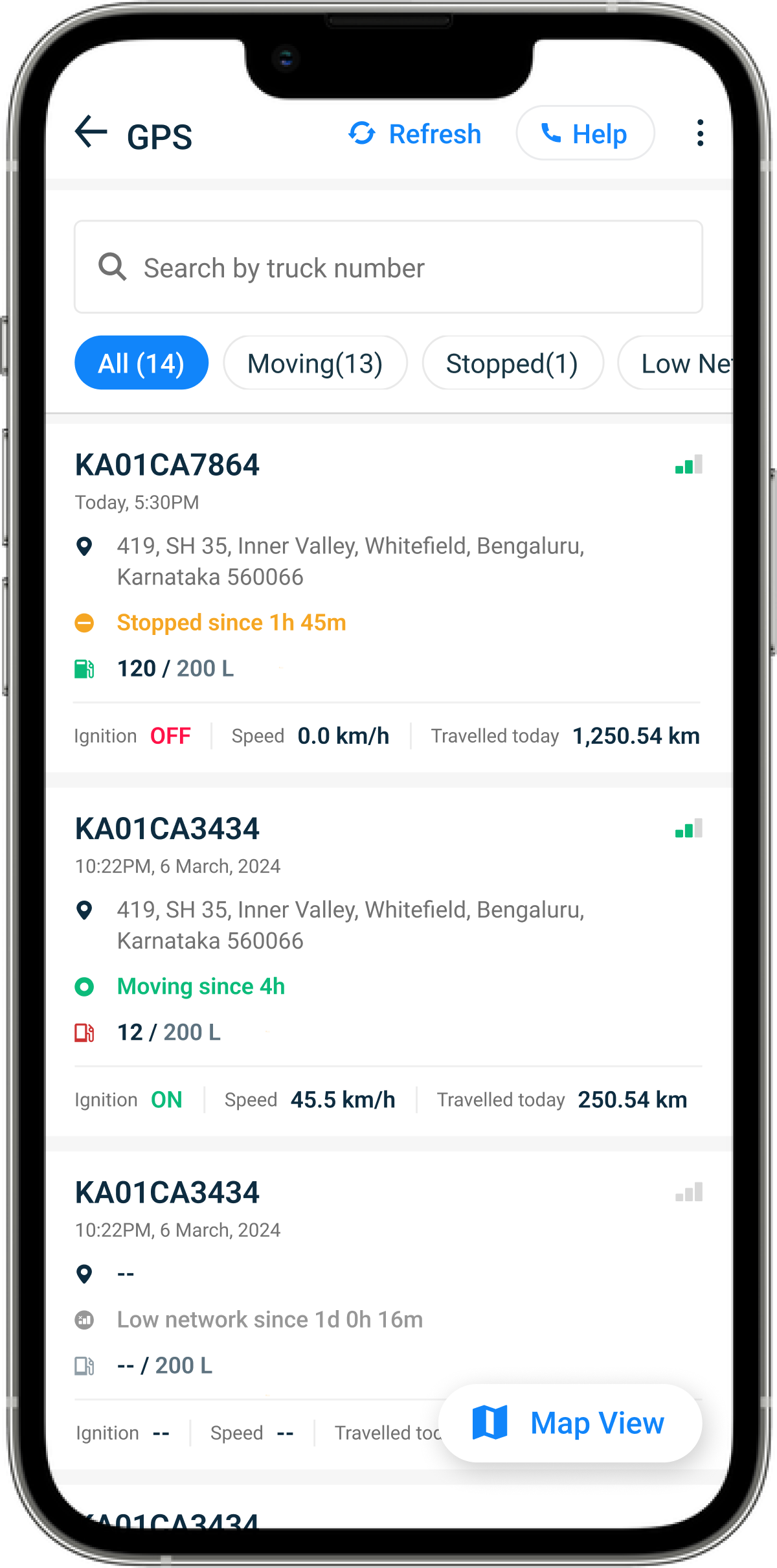
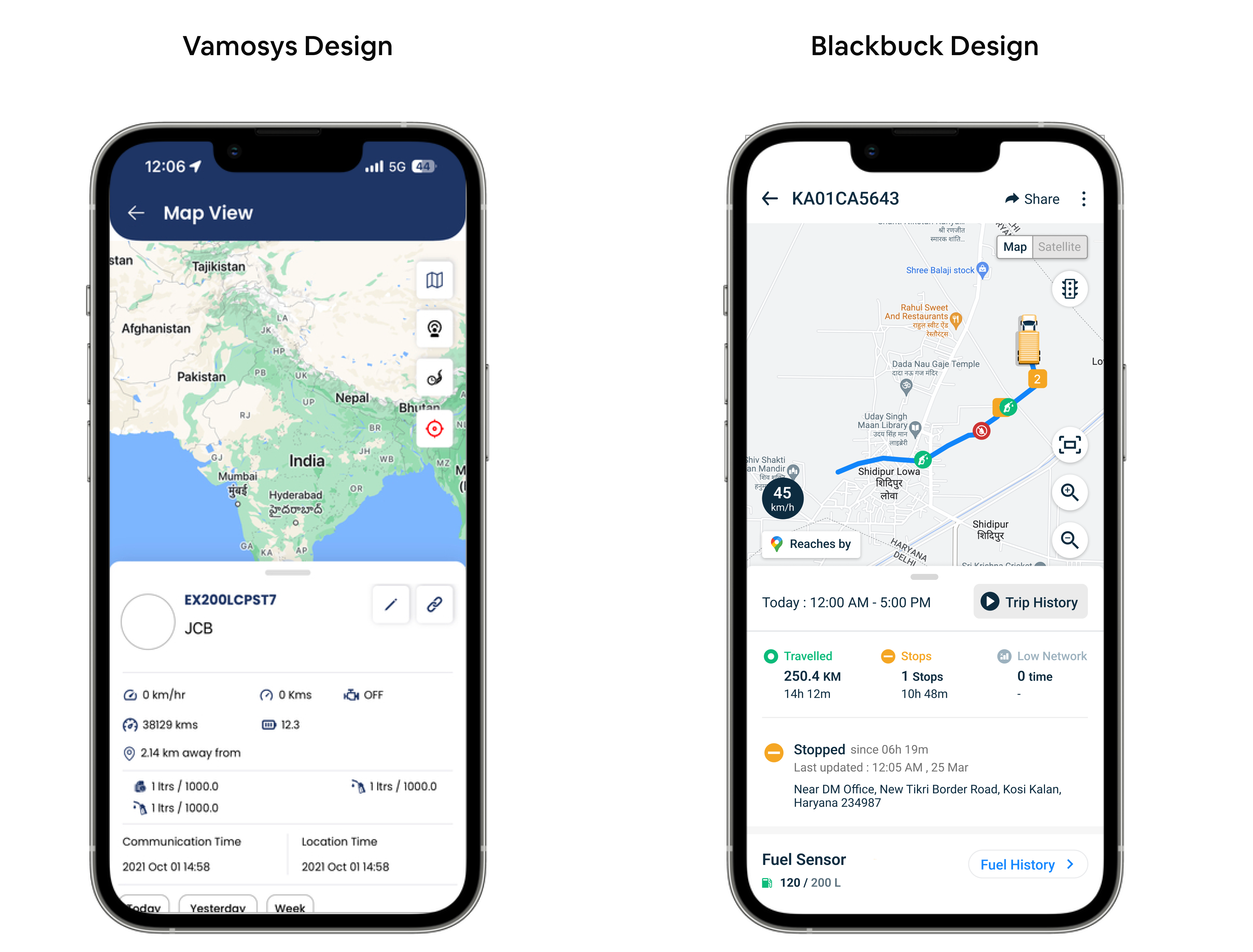
How Does the Fuel Sensor Work?
At its core, the fuel sensor system operates through a straightforward yet sophisticated three-step process that ensures reliable fuel monitoring for our users:
1. Professional Installation
The journey begins with installation. A BlackBuck technician carefully installs the fuel sensor device on the vehicle. This step is crucial as proper installation ensures accurate readings and long-term reliability. Our technicians are specially trained to handle different vehicle types and tank configurations, ensuring consistent quality across installations.
2. Real-Time Monitoring
Once installed, the system enables users to track and monitor their fuel levels in real-time through their mobile devices. Fleet owners can check fuel levels, track consumption patterns, and receive instant alerts about any suspicious activities. This real-time visibility gives them unprecedented control over their fuel management.
3. Ongoing Support
We understand that technical issues can arise, so we've implemented a straightforward system for maintenance and support. Users can easily raise tickets for any repairs or issues with their fuel sensors, ensuring minimal downtime and continuous monitoring capability.
Research and Discovery: Getting Our Hands Dirty
Understanding user needs isn't just about analyzing data from behind a screen. For the Fuel Sensor project, we knew we needed to get out into the field and experience the reality of our users firsthand. This meant visiting truck yards, talking to fleet owners, and observing how fuel sensors were being used in real-world conditions.
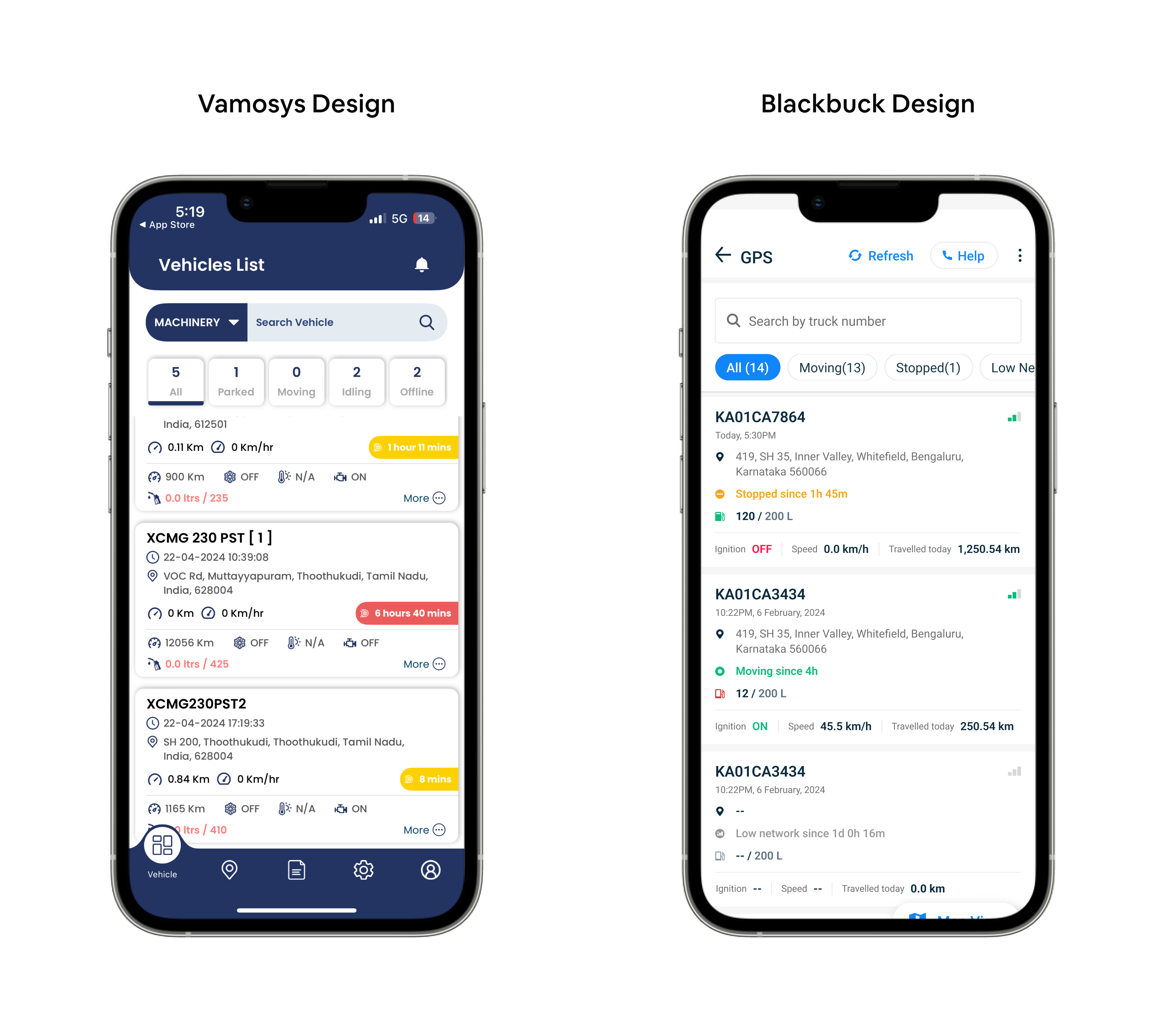
Field Research: Visiting Truck Yards
Our research took us to various truck yards across different regions. These visits were eye-opening, providing us with crucial insights that no amount of desk research could have revealed. We observed:
- The physical environment where sensors were being installed
- How technicians handled the installation process
- The daily routines of fleet owners and managers
- The real-world challenges of fuel monitoring
Understanding User Behavior
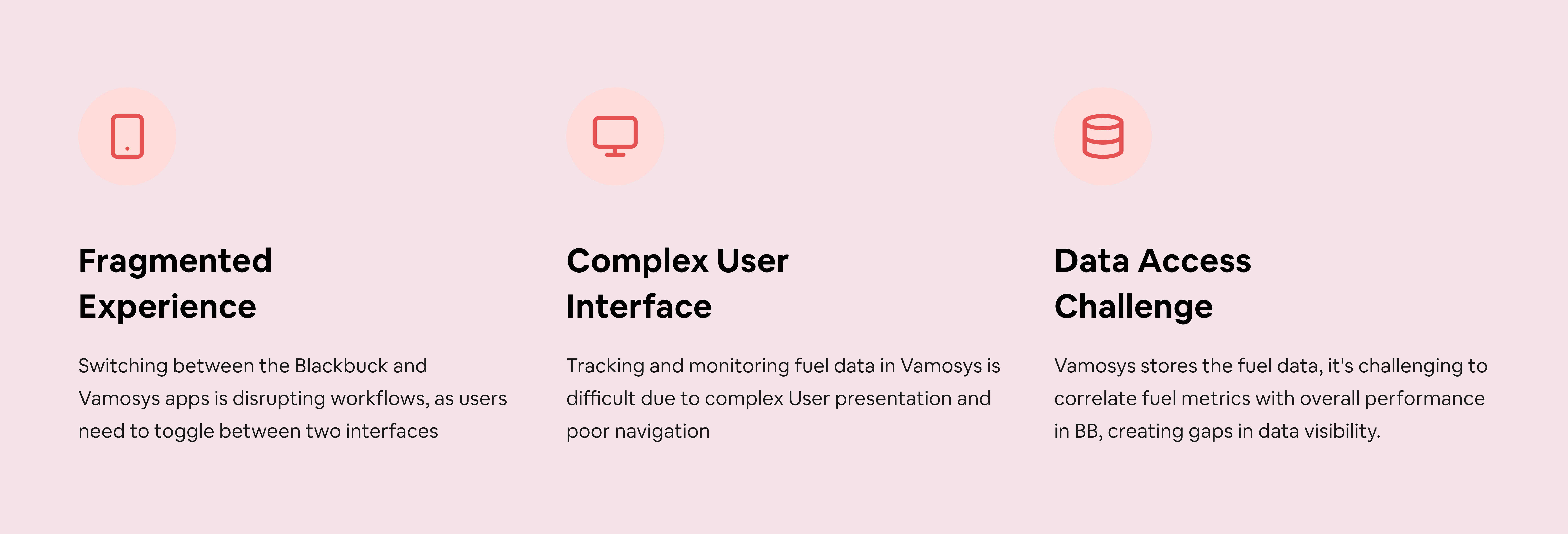
Through our yard visits, we were able to observe users interacting with both the physical sensors and the monitoring apps. What stood out was how users would constantly switch between different apps and interfaces just to get a complete picture of their operations.
- Understand how fuel sensors were being installed in vehicles
- Observe how users interact with the monitoring systems in their daily operations
- Identify pain points and opportunities for improvement
- Gather insights to inform our design decisions
This hands-on approach to research proved invaluable. Instead of making assumptions about user needs, we were able to see exactly how our system fit (or didn't fit) into their daily workflows. This direct observation would later prove crucial in shaping our design decisions.
Key Research Insights
Our field research revealed several crucial insights that would shape our approach to redesigning the fuel sensor system. Here's what we learned:
1. Primary Motivations for Installation
The decision to install fuel sensors wasn't arbitrary. Fleet owners had three main motivations:
- Real-time fuel level monitoring
- Prevention and detection of fuel theft
- Vehicle location tracking
This combination of needs highlighted how fuel monitoring was deeply integrated with overall fleet management concerns.
2. Frequent Monitoring Behavior
One of our most surprising discoveries was the frequency of monitoring. Users were checking their fuel metrics 10-15 times daily, significantly more than we had initially assumed. This high frequency wasn't by choice—it was necessitated by delays in receiving notifications. Users felt compelled to actively check rather than rely on the notification system.
3. Different User Types, Different Needs
We identified distinct monitoring patterns among different types of users:
- Fleet owners focused on comparing actual versus expected mileage to detect potential theft
- Construction equipment owners were more interested in hourly fuel consumption rates
4. Theft Alert Validation
Users developed a habit of checking the fuel sensor graph multiple times daily to validate theft alerts. This behavior indicated both the importance of the theft prevention feature and the current lack of confidence in automated alerts.
5. Sensor Accuracy Satisfaction
On a positive note, most users expressed satisfaction with the fuel sensor's accuracy. This meant we could focus our improvements on the software interface and user experience rather than the underlying hardware technology.
From Insights to Opportunities
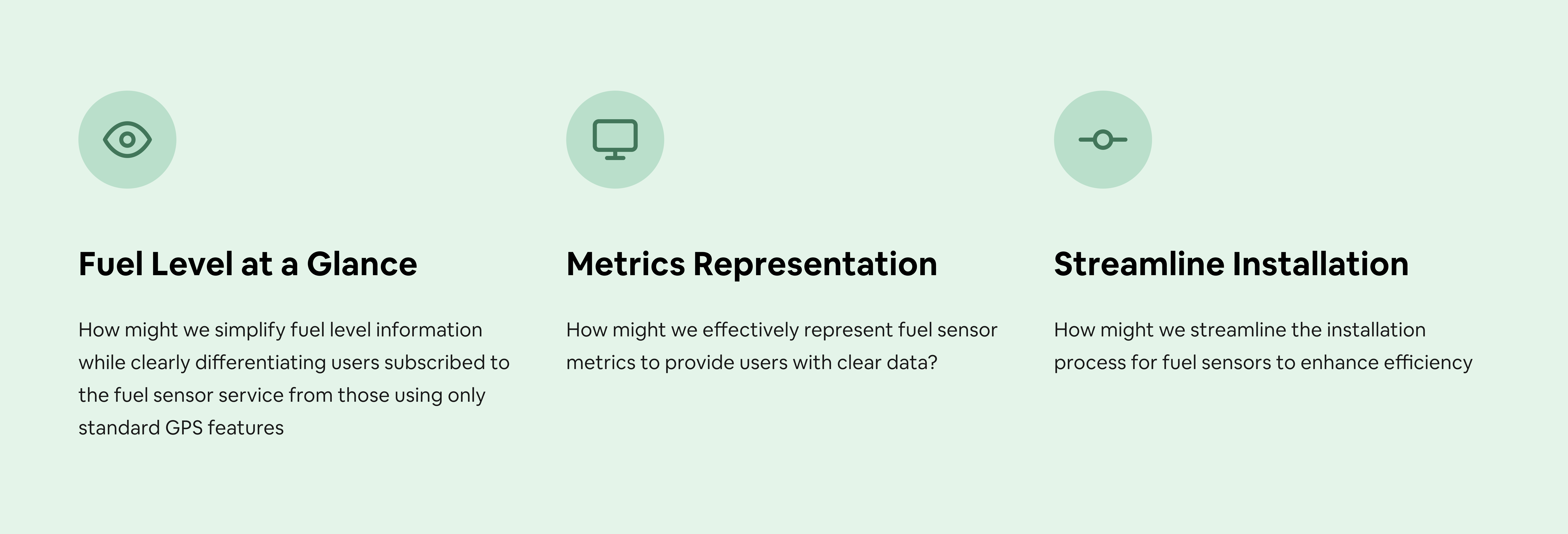
Based on our research findings, we identified three key opportunity areas that would drive our design solutions. We framed these as "How might we" questions to help focus our problem-solving approach:
Design Solutions: An Iterative Journey
With clear opportunities identified, we began the design phase of our project. We approached each challenge through multiple iterations, learning and refining our solutions based on continuous feedback. Let's walk through how we tackled each opportunity:
Solution 1: Fuel Level at a Glance
Our first challenge was making fuel information immediately accessible while distinguishing between different service tiers. This went through several iterations:
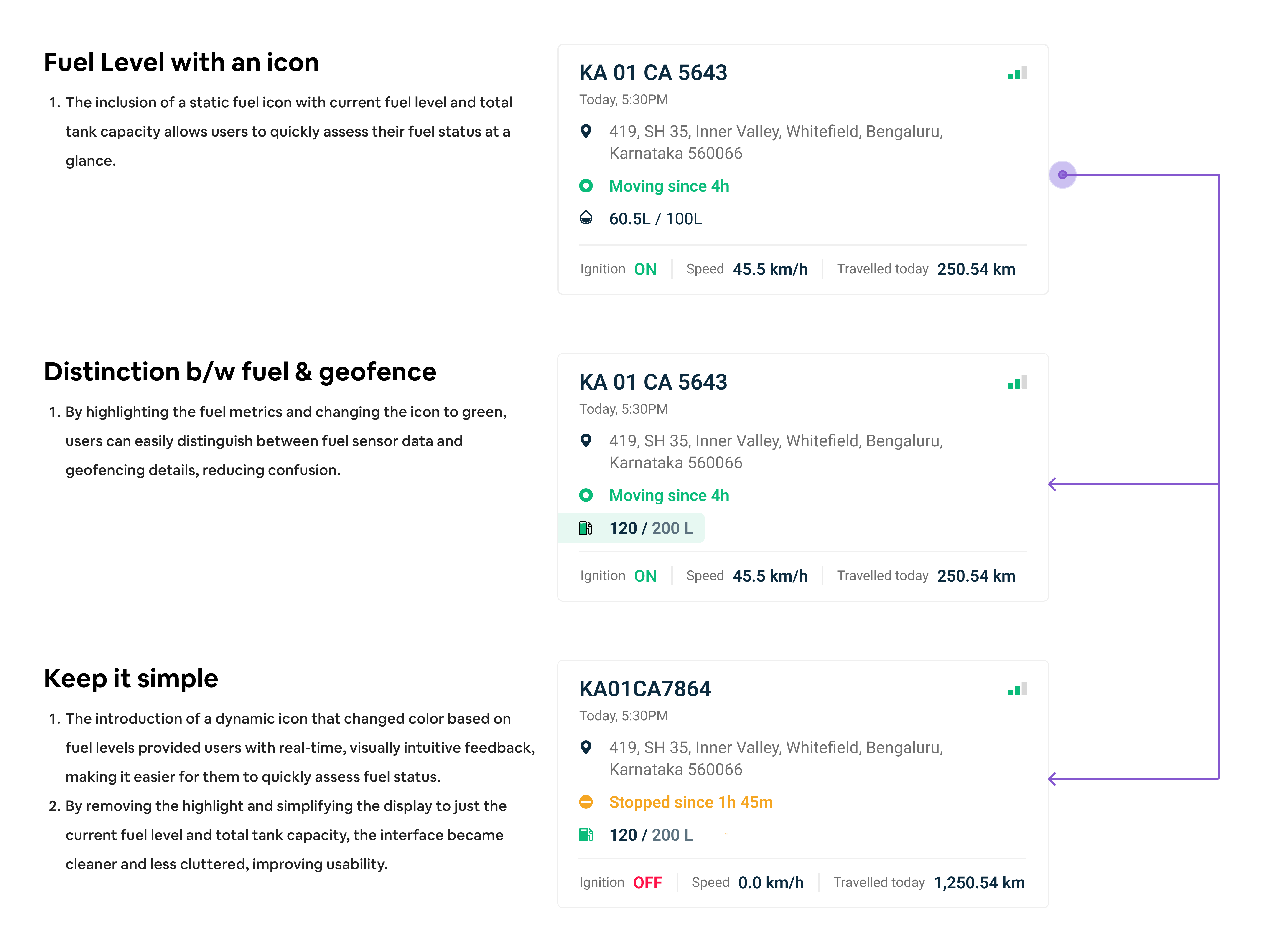
Iteration 1: Basic Icon Approach
We started with a static fuel icon displaying current fuel level and tank capacity. While straightforward, user testing revealed that:
- The static icon didn't effectively convey real-time changes
- Users struggled to differentiate between fuel sensor and standard GPS information
Iteration 2: Enhanced Visual Hierarchy
We improved the design by:
- Highlighting fuel metrics
- Adding a green icon for better visibility
- Creating clearer distinction between fuel and geofencing details
However, feedback showed that:
- The interface felt cluttered with too many visual elements
- The static icon still didn't provide enough interactivity
Iteration 3: Final Refinement
Our final iteration introduced:
- A dynamic icon that changes color based on fuel levels
- Cleaner, more focused display of current fuel level and capacity
- Simplified interface removing unnecessary highlights
This version succeeded in providing at-a-glance information while maintaining clarity and visual hierarchy.
New Design
- We made the fuel level a central element, using larger text and a clear icon to ensure it's easily noticeable at a glance.
- The fuel information is isolated and displayed in a more visible part of the card, reducing visual clutter and making it easier to monitor.
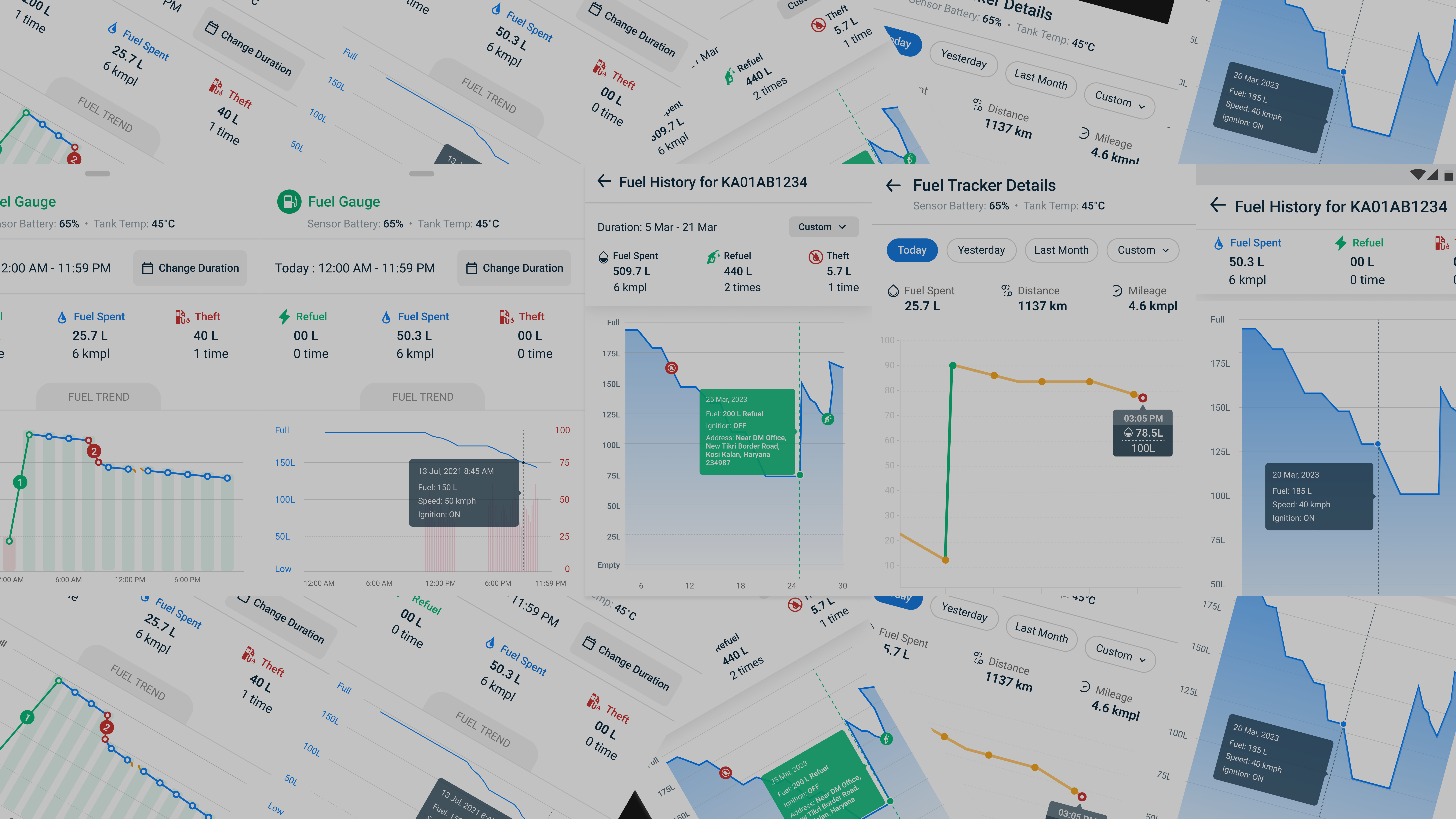
Solution 2: Evolving the Metrics Display
The presentation of fuel metrics and events was crucial to our users' daily operations. We went through several iterations to find the right balance between comprehensive data and usability.
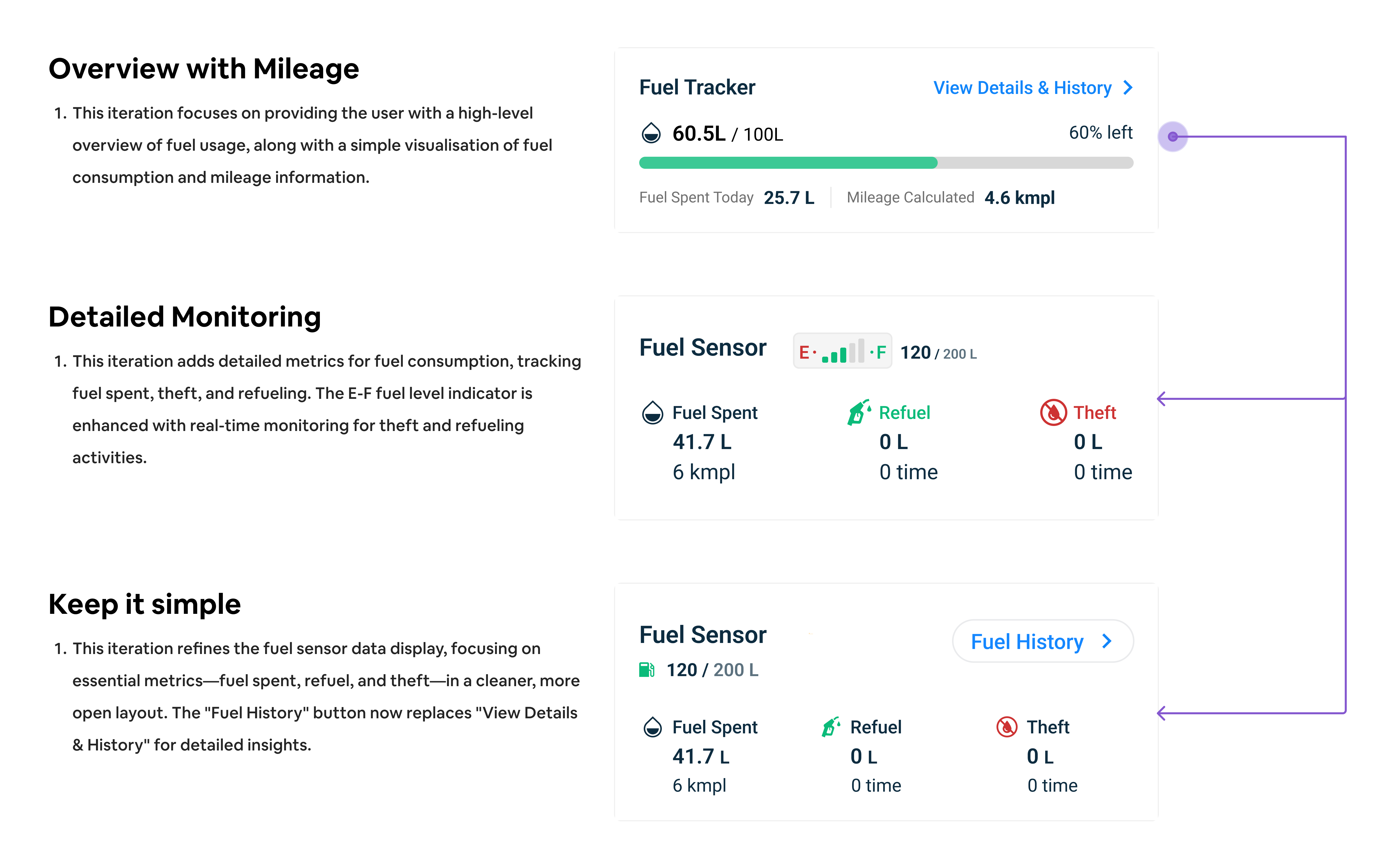
Iteration 1: Overview with Mileage
Our first approach focused on simplicity:
- Displayed basic fuel level (60.5L/100L)
- Showed percentage remaining (60% left)
- Included daily fuel consumption metrics
- Added simple mileage calculation
While this version was clean, users found it too basic. The feedback revealed that it lacked critical contextual information about theft and refueling events that users needed for effective monitoring.
Iteration 2: Detailed Monitoring
We then swung to the other end of the spectrum:
- Added an E-F fuel level indicator
- Incorporated detailed metrics for consumption
- Integrated theft and refueling tracking
- Enhanced real-time monitoring capabilities
Though comprehensive, users found the interface somewhat cluttered. The lack of clear visual hierarchy made it difficult to quickly identify the most important information.
Iteration 3: Simplified Insights
Our final iteration found the sweet spot:
- Focused on essential metrics (fuel spent, refuel, theft)
- Created a cleaner, more open layout
- Added a dedicated "Fuel History" button
- Streamlined the data presentation
While removing the E-F gauge meant losing one familiar visual reference point, the cleaner layout and focused presentation of key metrics actually improved overall usability and user satisfaction.
New Design
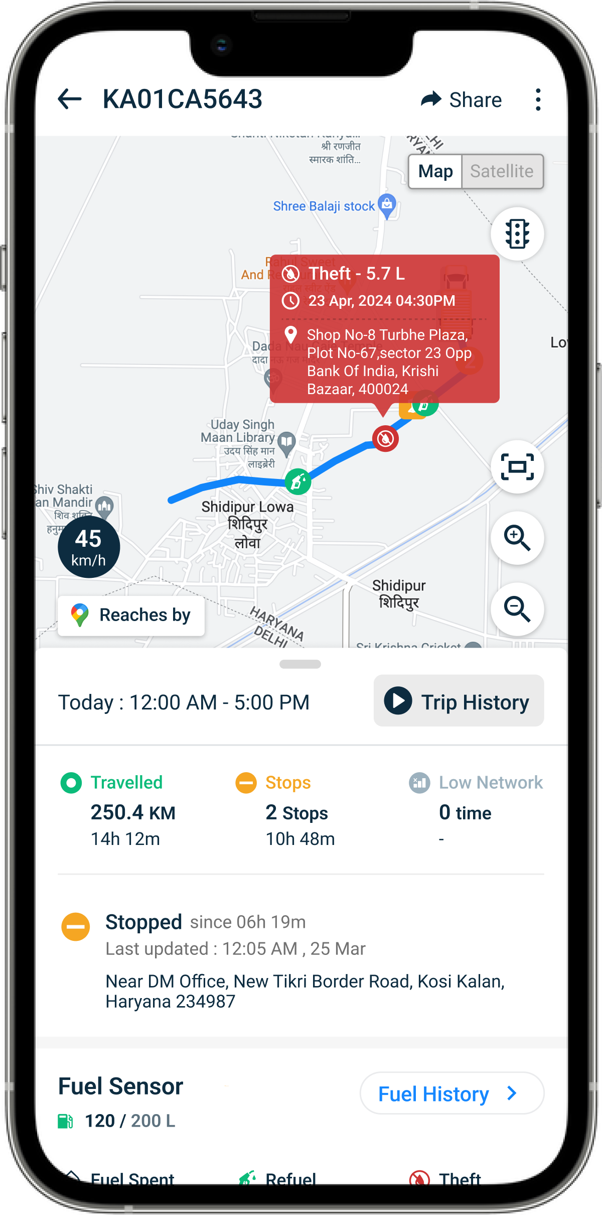
- Added events icons on the map to visually represent key events like Refuel and Theft, enhancing situational awareness at a glance.
- Provided metrics on fuel consumption, refuelling, and potential theft, enabling better fuel management.
- Ensured users could easily access detailed fuel data when they most needed it, enhancing task efficiency and relevance.
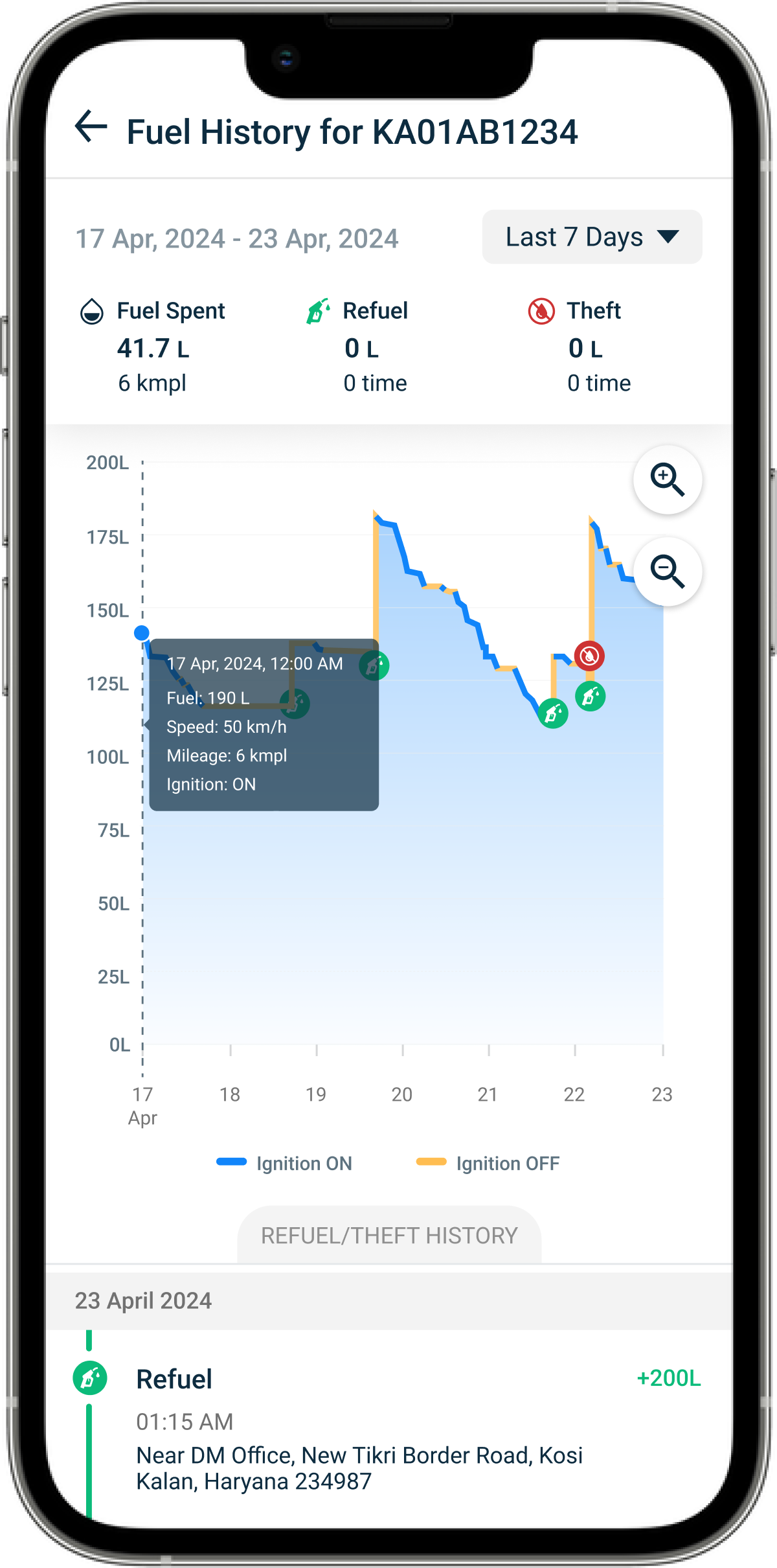
Solution 3: Graph Experience
The fuel trend graph was a critical feature that required several iterations to get right. Our users needed to visualize fuel consumption patterns, detect anomalies, and track events over time.
Multiple Design Iterations
Our graph experience went through several versions as we worked to find the right balance between detail and usability:
Early Attempts
- Simple line graphs showing fuel levels
- Basic time-based visualization
- Limited interaction capabilities
- Minimal event indicators
Challenges We Faced
- Users struggled to correlate events with fuel level changes
- Time scale interpretation was not intuitive
- Difficulty in distinguishing between different types of events
- Limited context for understanding fuel patterns
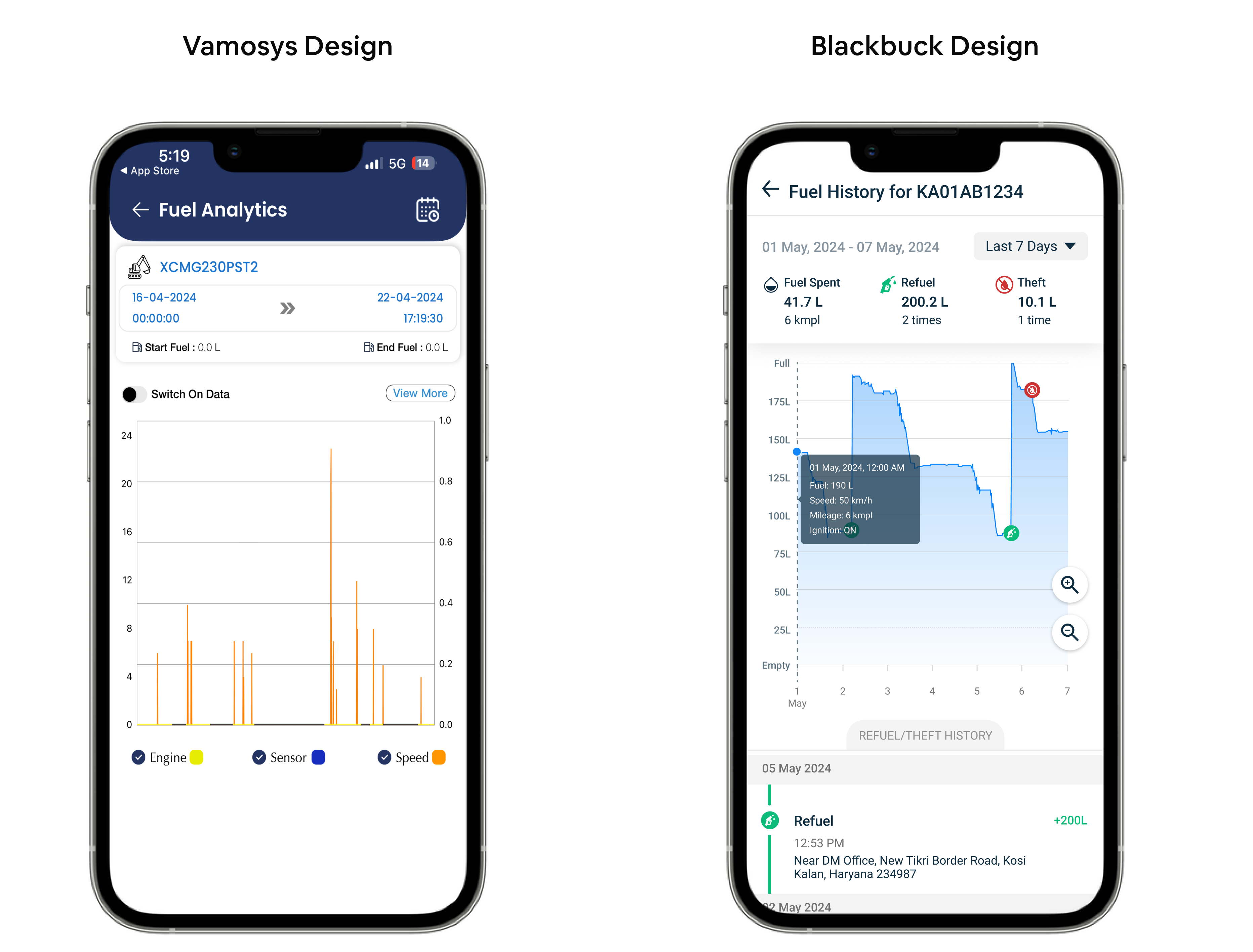
New Design
- The graph includes zoom in/out controls, allowing users to adjust the view for more detailed or broader insights into fuel usage over time, enabling users to focus on specific periods.
- The timeline below the graph displays a chronological list of refuel and fuel theft events, giving users an easy way to cross-check data from the graph with detailed entries.
User Testing
We conducted an online usability test with our users, facilitated through Google Meet. One of our CROs was physically present with the user, while we observed remotely. This session helped us gather insights into user comprehension and identify areas for improving the clarity of graph elements.
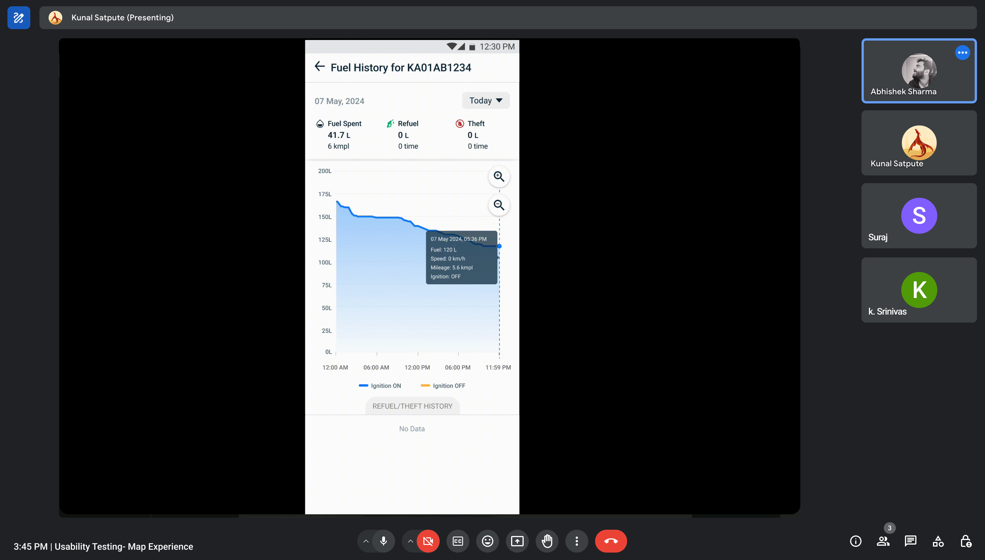
Goal
The goal was to assess whether users could understand the map interface and effectively read and interpret the fuel trend graph.
Usability Test Results
- Around 60% of users (12 out of 20) reported difficulty noticing the ignition line (blue) on the graph, and they were unclear about what the blue line represented.
- Nearly all users requested the inclusion of an ignition OFF line on the graph, in addition to the ignition ON line.
Updated Design
- We increased the stroke width to make the line more noticeable and added legends to clearly convey what the line represents.
- We introduced the Ignition OFF status alongside the ON status, allowing users to track both metrics on the graph.
Solution 4: Streamlining Installation
The third major challenge we tackled was streamlining the fuel sensor installation process. This was crucial as it represented the first touchpoint between users and our product - a moment that could set the tone for their entire experience.
The Installation Challenge
Our research revealed several pain points in the existing installation process:
- Inconsistent quality across different technicians
- Manual documentation leading to errors
- Lack of standardized procedures
- Difficult quality verification
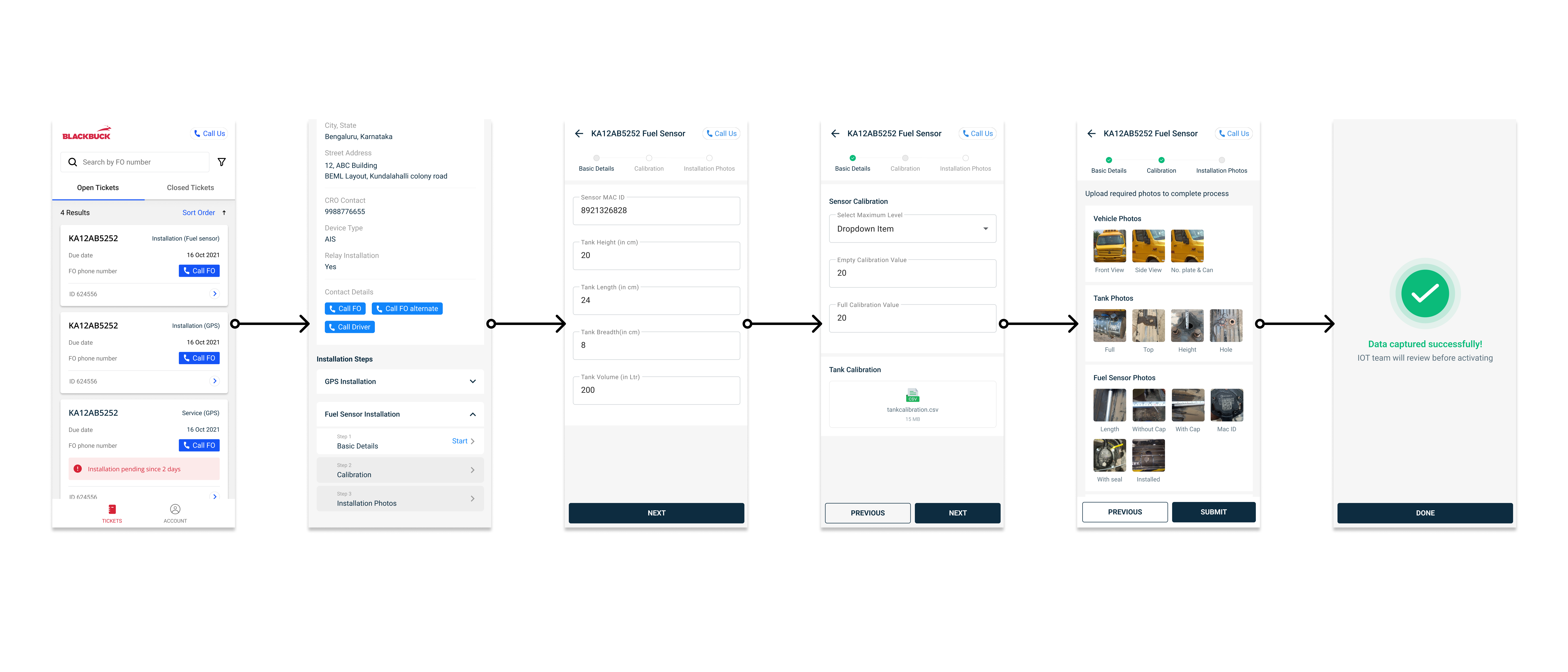
Impact on Operations
This streamlined process brought several benefits:
- Reduced installation time
- Improved consistency across installations
- Better quality control
- Easier troubleshooting when issues arise
Cross-Platform Solutions
As we developed our solutions, we recognized that different users had different needs and preferences for how they interact with the fuel sensor system. This led us to expand our solution across multiple platforms.
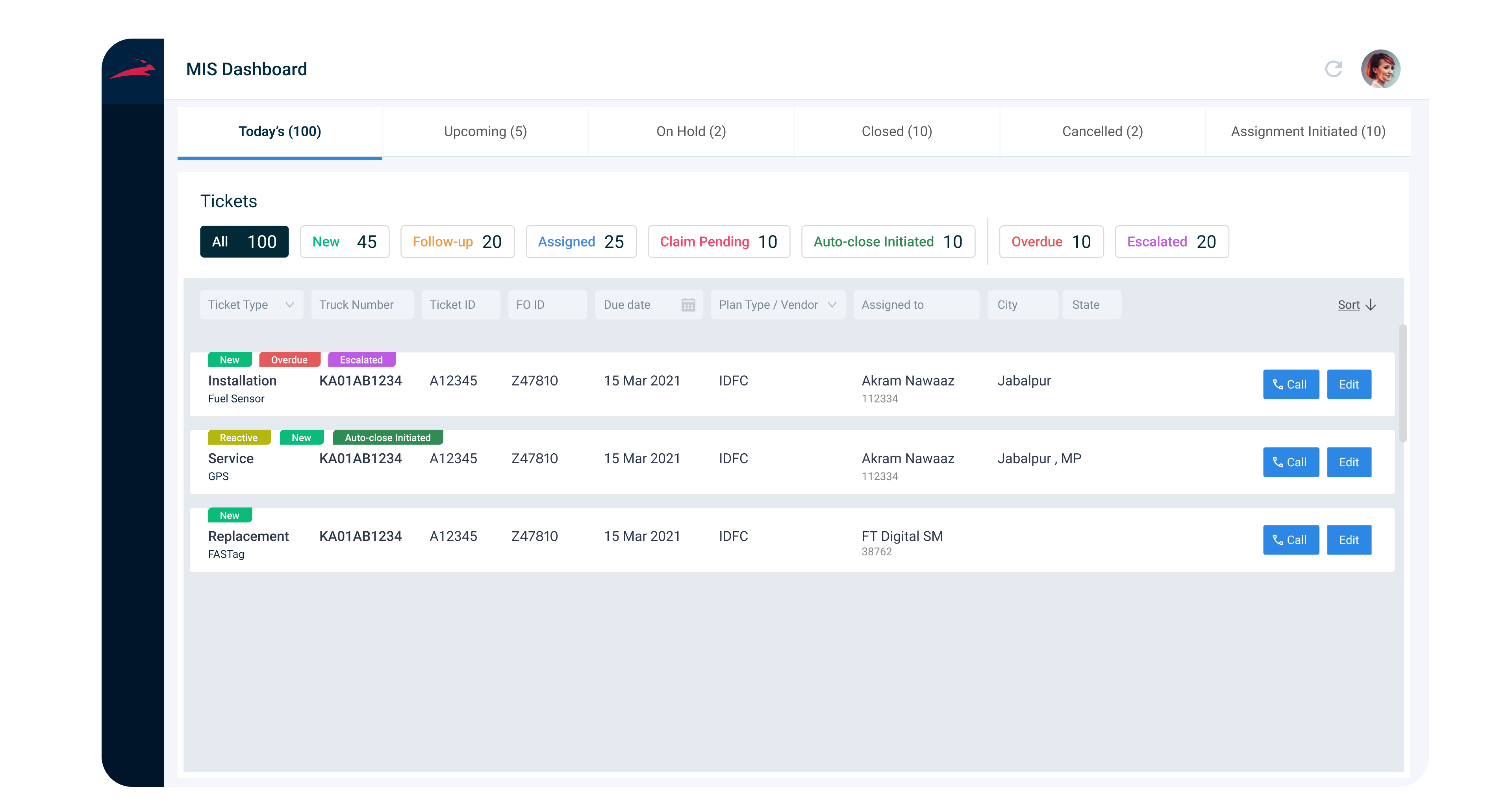
Internal MIS Dashboard
Our internal app was designed to give our team complete oversight of the fuel sensor ecosystem. This dashboard became the central nervous system of our operations, allowing our team to manage and track fuel sensor installations, monitor progress of each order, and oversee repair tickets. This comprehensive view of ongoing installations and repairs ensured that the team could efficiently manage workflows and resolve issues promptly.
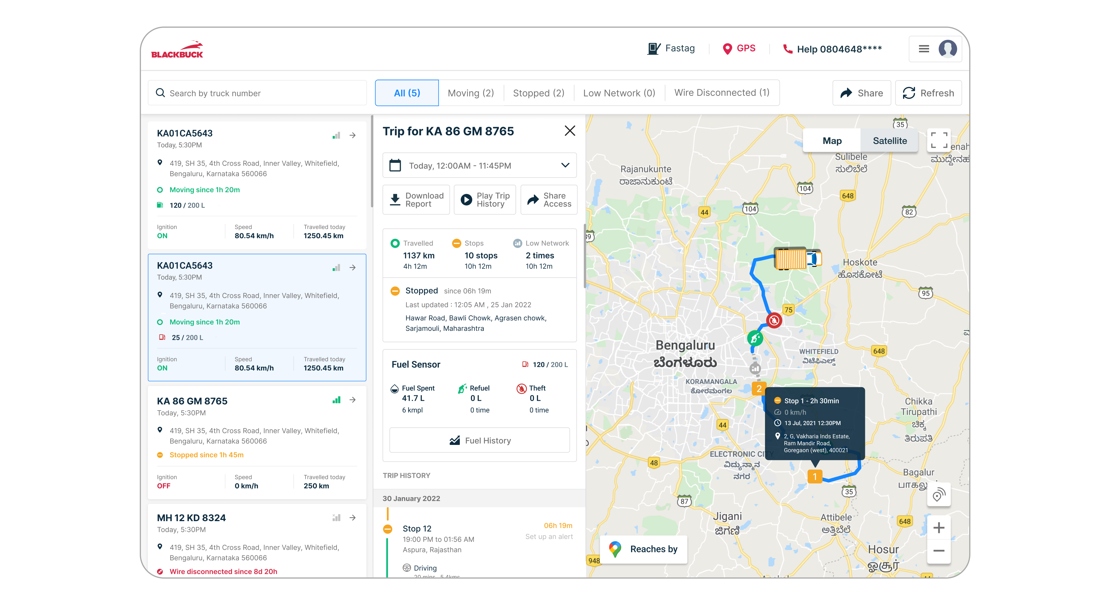
Desktop Application for LFO (Large Fleet Owners)
Understanding that Large Fleet Owners (LFO) often prefer desktop interfaces for monitoring their operations, we developed a dedicated desktop application. This platform offers real-time fuel tracking, refuelling, and theft alerts in a centralized solution. It provides these power users with the tools they need to manage their fleets efficiently while ensuring easy access to vital data.
Outcome and Impact
The launch of our improved fuel sensor system brought significant positive changes to both user experience and business operations. We rolled out the monitoring and tracking features in two phases, followed by the installation process improvements. This phased approach allowed for smoother adoption and gave users time to integrate the new functionality into their workflows.
Reduce Fuel
Cost
Real-time monitoring helped reduce fuel costs by 10%, driven by better fuel tracking and theft prevention.
Operational Efficiency
The dashboard improved repair management, resulting in a 15% faster response and reduced downtime.
User
Engagement
A more intuitive interface led to a 30% increase in active monitoring, with users engaging more regularly.
Straight from Our Users

Mahesh K
Maharashtra
"This new tracking feature is amazing! Now I have complete control over my fuel. I feel like I'm driving more efficiently and saving fuel!"

Santosh Yadav
Rajasthan
"The interface is so simple! I can easily check my fuel levels. Now I don't have to face any problems, and my work has become much easier."

Mandeep Singh
Punjab
"This new tracking feature is amazing! Now I have complete control over my fuel. I feel like I'm driving more efficiently and saving fuel!"
Learnings & Reflections
User-Centered Design Requires Iteration
Throughout the project, iterative design was crucial to refining the user experience. From heuristic analysis of the third-party app Vamosys to user research and usability testing, each step provided feedback that helped improve the product. The insights gathered during the usability testing session, where users struggled to read the fuel trend graph, highlighted the importance of continuously refining the interface to meet user needs effectively.
Collaborative Testing Drives Real-World Solutions
Working closely with the CRO during the online user testing session provided a practical understanding of how users interact with the app in a real-world setting. This collaboration allowed us to quickly identify pain points in the map experience and graph comprehension. Such partnerships between designers, stakeholders, and users led to more actionable insights, enhancing product functionality and usability.
Designing for Scalability and Adaptability
As the number of installed fuel sensors grew from 191 to 843 post-release, one key learning was designing with future scalability in mind. The product not only had to meet current user needs but also anticipate future growth. By incorporating flexible design patterns and focusing on key metrics, we were able to create an interface that scaled with user engagement while maintaining clarity and usability.
And... That's a Wrap! 🎉
Thanks for diving into my journey with the fuel sensor project. It's been a challenging, yet rewarding ride, and I've grown immensely as a designer.
Shoutouts 👏 Big thanks to the amazing team who made this possible:
- Utkarsha Chandra - for incredible product leadership
- Karteek - for strategic vision and guidance
- Our developers - for bringing the designs to life
- BlackBuck's fleet owners - for valuable insights and feedback